Find where you are going super easily with a travel itinerary design that focuses on putting the important information front and center.
A friend of mine recently travelled. I had a look at their itinerary and cringed as it was too difficult to find all the important details but of course they are all important details.
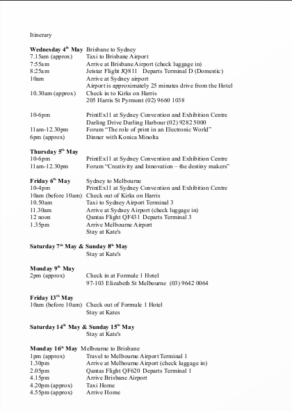
This is the word doc that made me cringe:

How are you supposed to give the taxi driver the hotel’s address? What about getting the phone number for that restaurant? What time we were supposed to meet the guide? Nothing is easy to spot in this.
The design challenge:

Since they were doing two stops on their trip it made sense to start with splitting up the Sydney trip and the Melbourne trip. I have a plethora of international standard symbols in EPS format so I grabbed Hotel and Plane as these are important details and need to be seen at a glance. I created a symbol which was the logo for the Printex convention they were going to. The flight details needed to stand out amongst the other flight information as well as the hotel details needing to stand out amongst the other hotel information. Once all these were in order it was easy to add in days, and lines to separate them all.
This is all the same information as the original except now it includes visual hierarchy, symbols and white space.
I asked my friend how the itinerary worked for their holiday. They told me that is was so much easier to use than anything they have previously used. They also told me they kept showing off this travel itinerary design to people.
Can I help make your itinerary easier to read!
$50 will get you a similar travel itinerary.


