I needed an example annual report design to show to a client. I had not done a full annual report design. Only a rollout where I took the design created by the design agency and made all the pages. I knew that annual reports are a great marketing opportunity. I had also made a variety of different other materials for the financial sector as well as academic and commercial reports. To me, annual report design looks like a great way to use so many of my skills. So I decided to have a go at making a design from scratch.
I found an existing annual report so I had all the various data and sections. I designed around having big full page section starts. It is a lovely way to add a bit of luxury. I chose to go with A4 for the intended Australian audience.

Another big element to take the time to design was the actual tables. In an annual report design the financial tables are such an underutilised way to incorporate some branding. Usually tables are formatted very basically. It is nice for the modern style but they really tend to lack creativity. I wanted to make financial tables that were easy to read which is why I have used background colour to break up the table. And then the thin keyline strokes help define the cells without dominating. I am hoping that because the tables look so easy to read, stakeholders will read them.
Remembering your audience
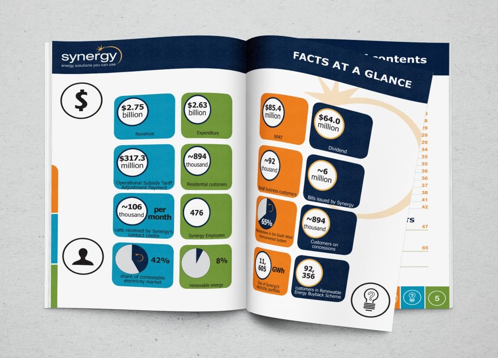
Again with audience in mind, stakeholders who do get a copy of an annual report tend to glance. They might read sections but the financial tables are numbers. And so I have designed around this idea and made a double page spread with key figures at a glance.
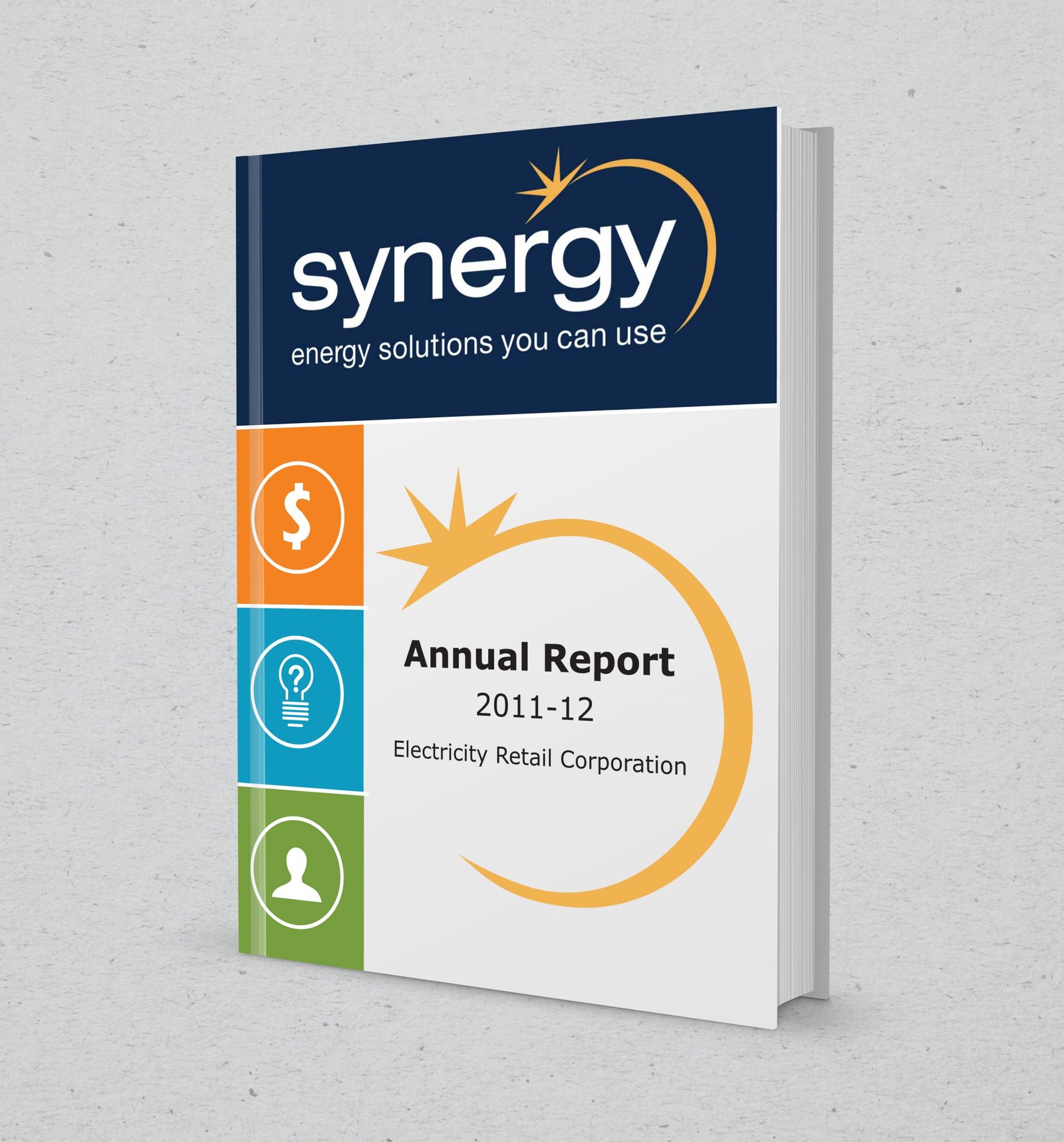
And of course an appealing cover to entice people to open the document in the first place.
Need help making your annual report this year? Check out the Lakazdi.com store for prices based on your page count.

