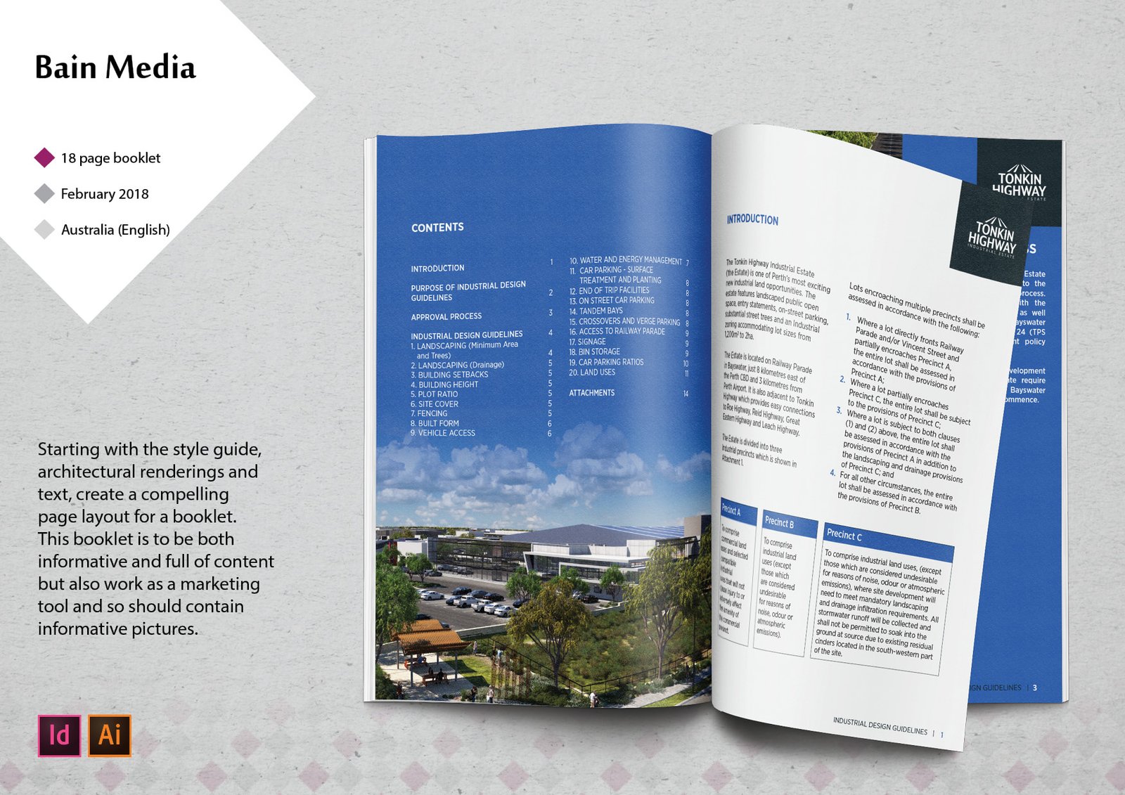
Printed booklet.
I worked in collaboration with Bain Media on this one. This printed booklet was an interesting challenge. Partly because in the design brief we were given very little design direction because it is a new building project with no history of content to match. In terms of branding, there was a logo and styleguide which means a lot. I got to start with colours, fonts, and some idea about amount of white space to include on the page. The cover design was also basically done, some minor tweaks required.
So starting with the blues and the white space, I started exploring ways to break up the content. The wall of text in the original Word doc would never be read by anybody. This booklet needs to be read. It is not only the building code guidelines for once the project is built. It is intended to also be promotional and used as a marketing tool during meetings with companies wanting to invest in the project.
By having a very clear intention or purpose for the document made it easy to go with a design more like a glossy magazine than a policy document. It was also very helpful to get to start with so many wonderful renderings supplied by the architectural firm.


Highlighting content, ensuring readability
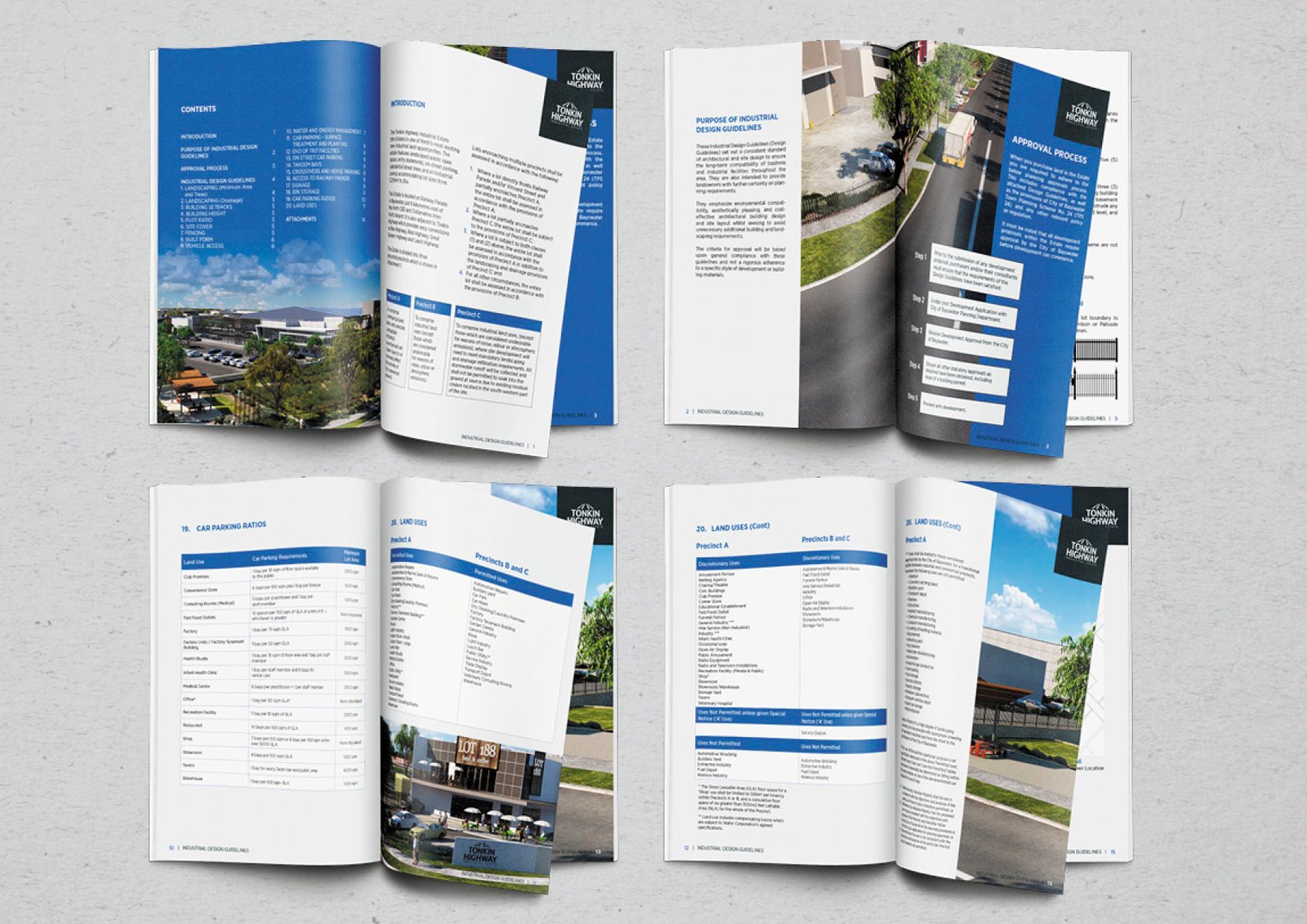
If I wanted to, I really could have put all the content on less pages. Crammed everything in. But I knew that the booklet would not be read. I am trying to ensure readability here. So by chunking content in a way that kept the amount of content on a page to one topic, I am able to have readers attention for long enough to get that information across.
With the information about a process, I chose to highlight this. It takes a whole page. The actual paragraph explaining is a thin column. And then the break down of the steps is in it’s own box. Then this flows onto the next step. By having these boxes white on a full colour page, they are really emphasised and stand out. Nice trick.


Let me know if you need any assistance in making a printed booklet for your brand.

