 One of the things I like to do the most with document design is keeping things consistent. This helps build brand. Every time I make multiple documents for a company I make a document which I call ‘elements’. It’s an important part of my workflow process and one I’ve cultivated over time. In here I am putting in various items that I know I will want to use over and over again. I understand that Adobe CC now has libraries but I still like this simple and easy method as my file is already right there alongside my project and I can more easily send this file to someone else to keep working. I keep the file open when I am working and each file is as unique as the document it came from.
Here are some ways I use ‘elements’ to save time and more importantly, keep things consistent across a large document or series of documents:
Boxes:
For workbooks that have various types of pull outs, I have given each box a name and I use the box type each time. They are already set to the right size, they are even correctly positioned on the page so on this document, I ‘copy, paste in front’ and it is always properly positioned at the right width and I change the height.
The green box is a note for the client, a purple box is a note for me.

Font styles:
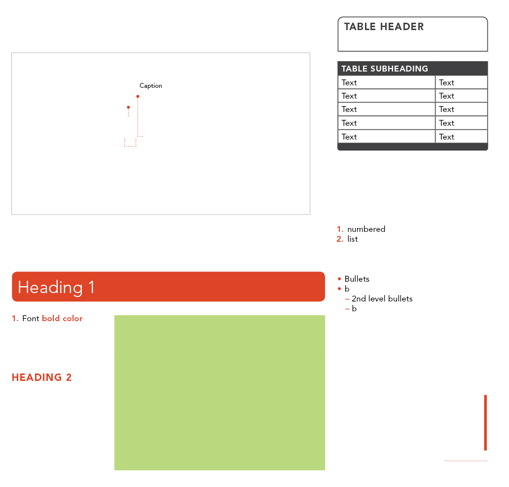
When working on a simple one pager document that will always have the same few elements on it I have more of a starting document than an elements document. Or template. But the template contains all the various types of font styles (that are also paragraph styles) set out on the page, some exactly where they will end up going on the page when finished. Others are just there so it is easy for myself to remember what the other styles available to me are (bullets, numbered list).

The rest of this page has a few different ‘elements’ that I want to use over and over. These are the lines. There are two styles of lines available and by using these, I won’t have to remember specifics about the stroke. A table is set up with table styles. The strokes with a big dot on the end has that built in so I save time by just changing the length of the line. The green box is ready for an image to be placed and it already has a ‘wrap text’ set up on it. Time saver!
Specific symbols:
For math textbooks there is so many specialised symbols or formatting it is hard to keep track of them all. So I have these set up inside my elements document. In this case, I am keeping whole blocks of content ready to go because this is a 300+ page book with some repeating items. A heading style here already has the line underneath built in but I have an anchor set up for the image, this way I copy and paste the whole block in and the image will appear and move within the text flow. The other content blocks here are set up and ready to copy and paste and then bring in the relevant content. Some are simple textboxes where as others use tables to help keep everything where it needs to be. The lightbulb box is a text box with ‘text wrap’ setting. Copy, paste, edit, done.

Sometimes I just need to have super quick access just to specific symbols so I keep these as an elements file. I know the ‘glyphs panel’ has a frequently or last used set up but when I switch between projects or make a new document after some time, I want to be able to keep this time saving device.

Spacers:
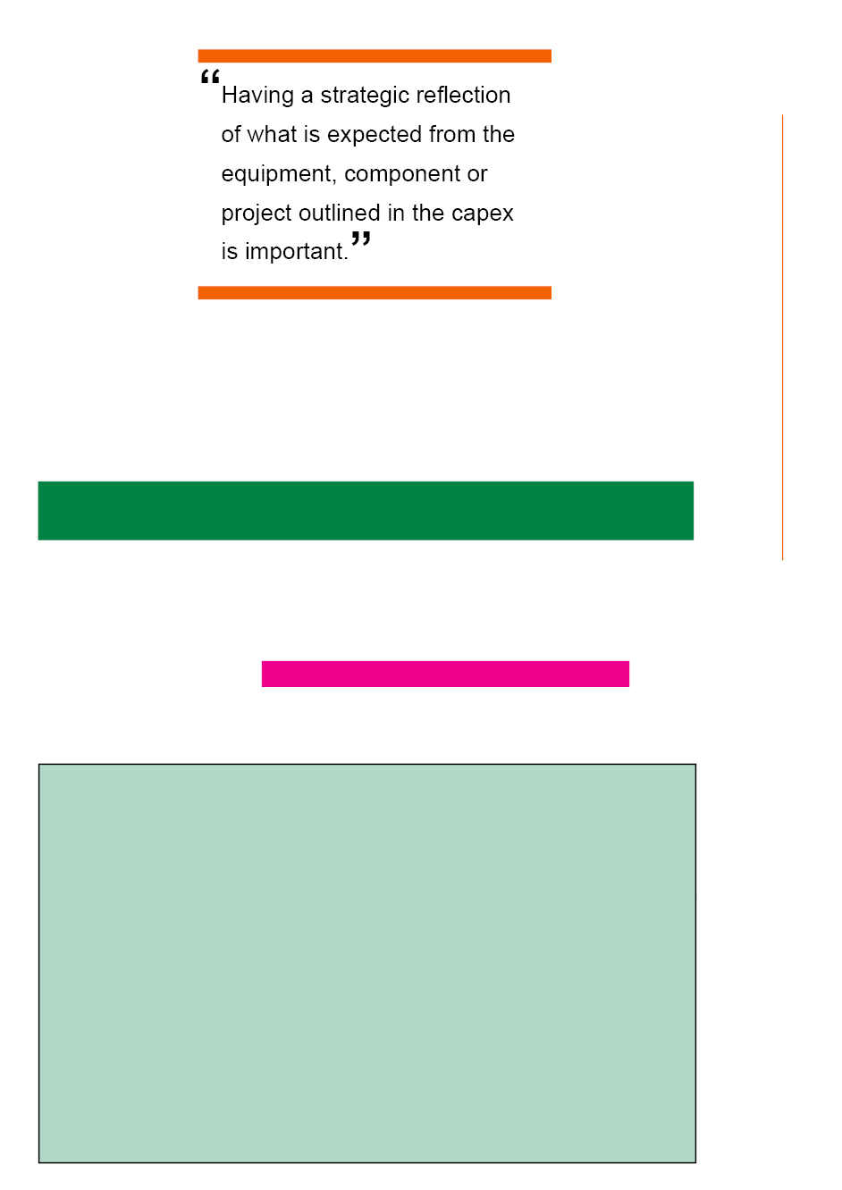
This elements folder is pretty basic: lines, pull quote, text box with background fill and stroke. But the Dark green and magenta boxes are spacers. I have spacers in all my documents. It is nice to have a grid and always stick to it but some things are meant to be broken. Almost. If I ever deviate from my grid, I still like to keep things spaced right. So I am forever moving around spacers (usually a small and a big) to make sure that everything has the right amount of space around it.


